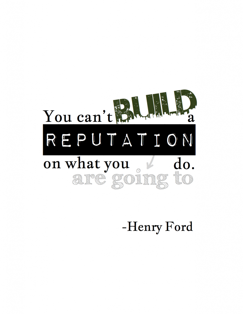
I’ve been working out my motivators and sources of inspiration lately because I’m thinking about what’s next in my career (more on that to come). I followed my creativity today to make this:
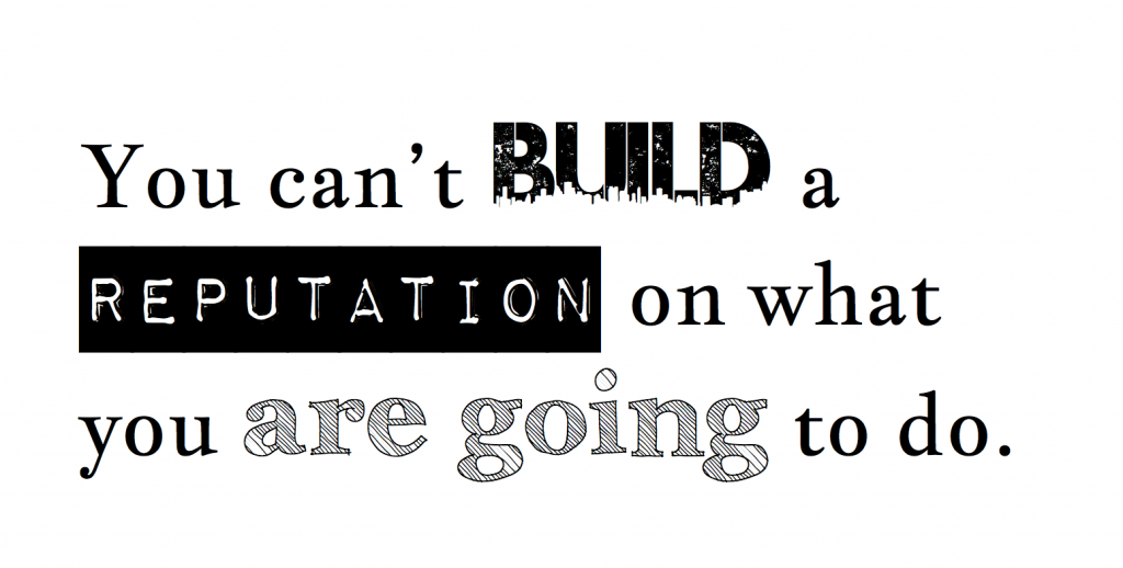
I’ve been collecting quotes and font/calligraphy ideas on Pinterest as inspiration for original posters. I started in Pages by typing out the quote. I decided which words or phrases I wanted to emphasize. I put much thought and experimentation into determining which fonts would convey my message while playing nicely together.
I highlighted the word “build” because I love creating things that people use and it’s the main action/verb. I was searching for a font that emphasized engineering, drafting, and/or architecture. I landed on the Urban Jungle font for not only the aesthetic, but because I’m a happy city living convert. I’m a huge fan of Philadelphia and feel that I’m building toward something here!
“Reputation” is what the whole quote is about. I wanted a font that was bold to make it a prominent part of the piece. Here I used label as a metaphor for one’s reputation (Font: Impact Label).
Since somedays, failures, or could have beens are suggested by “are going to,” I wanted to find a font that was an outline. Although these hopes and dreams aren’t yet substantial, they ain’t nothing neither. Archistico is great because it’s an outline, but not has some substance and weight. Finally, I didn’t want the rest of the text to clash with the three fancy fonts, so I went with Jacques Francois.
I was happy with the font selection, but felt the first iteration was a little flat:
The next step was breaking out each text chunk into individual text boxes. That allowed me to use different configurations, colors, and angles to make the piece more interesting. I wanted to emphasize the “are going to” section and make it look like an afterthought. What better way to do that than with arrows (used PWNewArrows font)? Finally, I tweaked the colors and voilà!
What do you think?


That is pretty cool. I really like the BUILD font.
The REPUTATION is sort of bolded, but the text is also decidedly smaller than other type. I wonder if just a font changed block bold wouldn’t work better. Especially now that it is separated on its own line. If you expand the REPUTATION with the font change, it gives you the ability to kick the “a” and “do” out a little as well that will let to flow as read a little easier.
The “are going to” in a pencilled in font is brilliant. I would try a common insert symbol of the hand drawn carrot “^” instead of than the down arrow. It would pull the text in, where the arrow feels like it is pushing me out.
Joe,
I’m glad you liked it! Great points on the reputation font and direction of the arrow (I had experimented with ^, but didn’t try a ton of fonts). Thanks for all of your suggestions. I will experiment with them today.